2024
UX, UI, Product Design
UX/UI Designer

On Instagram, the fastest growing teen sharing format is called "Notes". It is a status update feature that allows users to share short thoughts, comments, quotes, music, polls, and more with their followers. However, we noticed in 2024 that interaction with notes tended to be consistently low (in fact, 77% of notes had no engagement at all). How might we encourage users to engage more frequently and positively with notes?
While many teens say they share notes without the expectation of a conversation, we know of them are more retained when they receive feedback. I believed that giving notes consumers a way to share feedback in a lightweight way without sending a DM will relieve the pressure of messaging, drive note engagement, and therefore encourage notes producers to create more notes.
UX research, UI design, Prototyping, Animation
I began with a deep dive into our data science and user tests to better understand the motivations users have in creating notes and what they try to do when reacting to their friends. During testing, I learned that people liked having a lightweight, easy way to share what’s on their mind and start conversations. From asking for recommendations to sharing what they’re up to, Notes give people that casual and spontaneous way to express themselves and connect with each other. As a result, any interaction with Notes should be equally light, simple, and fast.
Then, I started drawing. From wireframes to prototypes, I created a breadth of design solutions that utilized our existing design system components to create a familiar, simple, and yet entirely new interaction pattern.


Once the design was more defined I started to think about interactivity. For motion design, I focused on creating a dynamic range, leaning into color and delight, repurposing existing emojis and our brand gradient to add a custom feeling to the experience. Careful choreography made each animation unique to match the specificity of the action taken, such as a heavier stamping action for a double tap like on a Note, versus the fluttery stream of hearts a user sees when their Note receives a like, mimicking the liveliness and immediacy of reactions on livestream video.


I also determined the flow of this new experience for both the sender and the receiver. I created a NUX for first time users as well as a notification system that synced with the user’s OS in real time. This way users could easily return to Instagram to respond to the reactions on their Notes, creating a positive feedback loop.
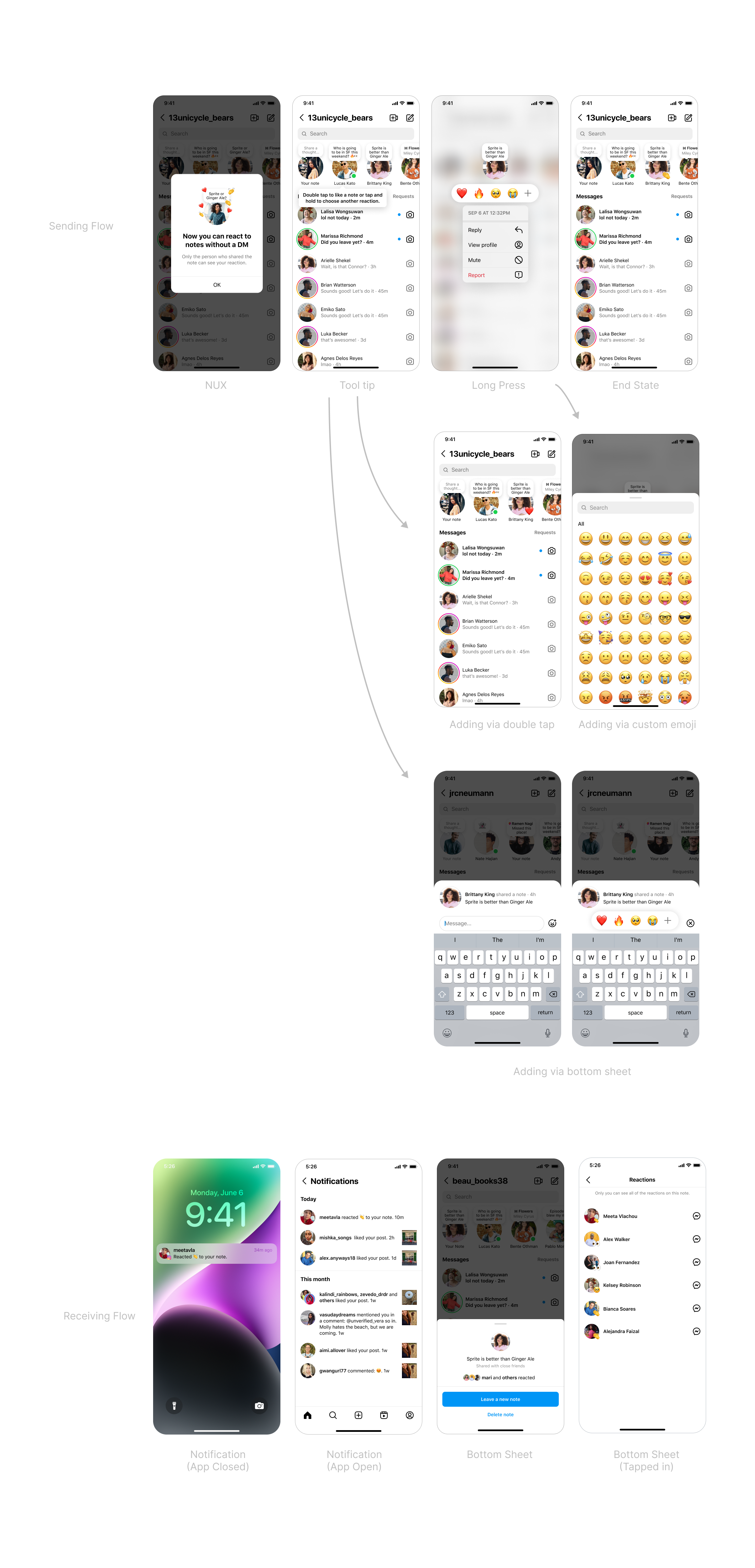
I also had to consider how this would impact the larger ecosystem of Instagram such as what likes and reactions would look like when shown on a user’s profile, and how the user flow would differ. I used the new components I designed to create a tailor fit experience for profile that maintains the integrity of the original experience on Notes, maintaining simplicity, craft, and parity.


Notes is a light-weight feature that makes it easy to share a status, so interaction with it also needs to be light and easy.
Better interaction with Notes also inspires more frequent creation of Notes.
Giving users a robust notification system on and off the app improves retention and revisitation to the feature.
Users want a larger variety of creative ways to interact with Notes
Creating parity across surfaces will ensure users learn the new way to engage with Notes faster.
Users are more likely to use a feature if it's fun and delightful and feels customizable.
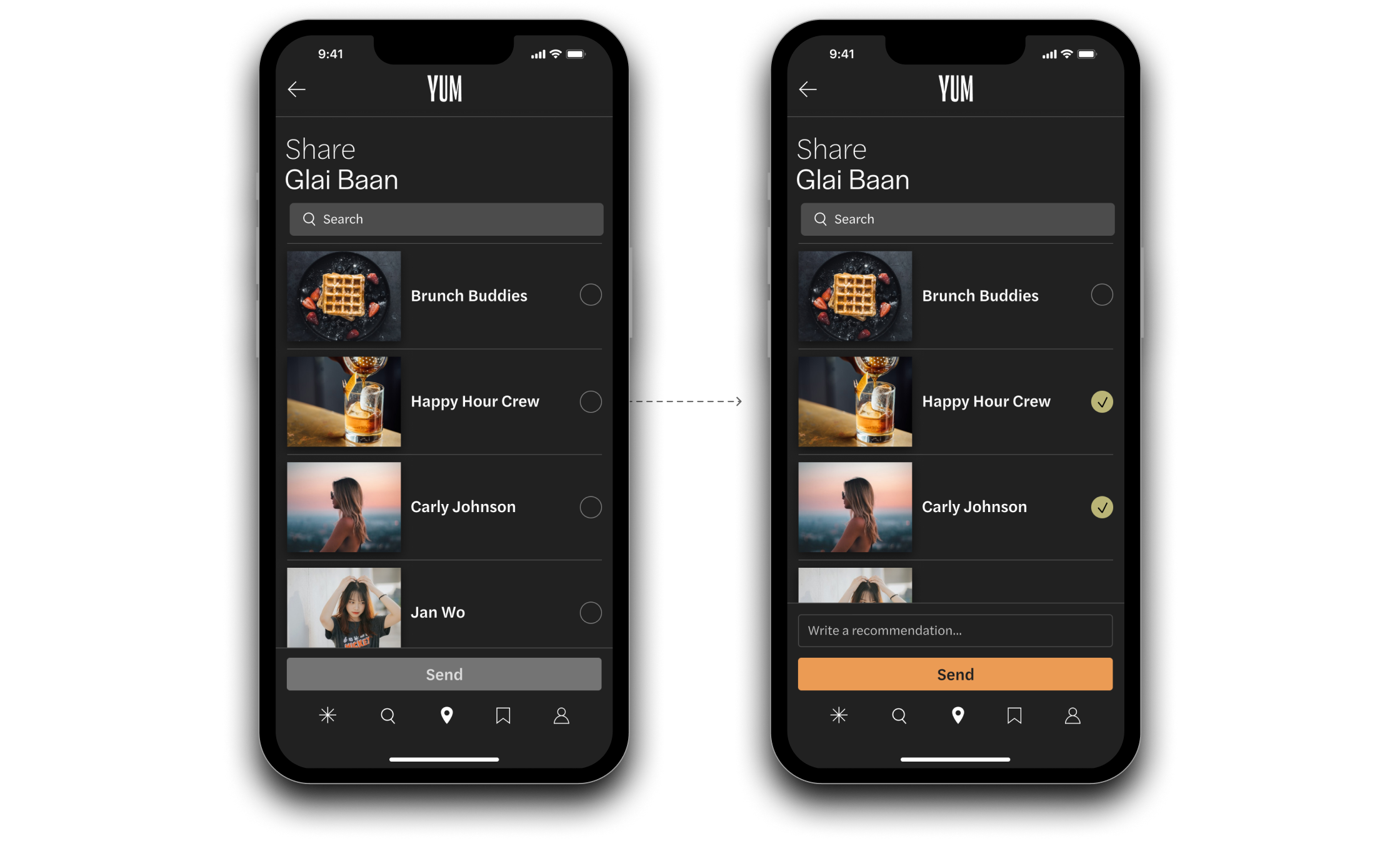
YUM makes the process of finding a restaurant, saving it for later, and sharing it with friends simple and engaging. It connects people to a social network of fellow foodies and only suggests restaurants that match up with each user's preferences and positively reviewed and rated dining experiences.
Intro screen and onboarding

Users land on the map screen after signing in and when opening the app, making searches quick and easy.

After finding a restaurant, users can then save it and add it to as many lists as they'd like

After saving they can share it with their friends or friend groups
Users can follow friends and read their reviews or write a review and share pictures of their own dining experiences

Profiles feature a recommendation section where users can add their top rated spots

YUM recommends restaurants based on a users location, friends, saved restaurants, and their positive posts and reviews.

Integrates all needs into one streamlined experience
Suggests more personalized restaurant recommendations
Supports social connection and engagement
Saves favorites for quick reference later
Gives users more flexibility to create specialized lists
Provides a source of reputable reviews from trusted friends and influencers

